

Call Me Ishmael: Chasing the White Whale of a Member Portal Redesign
- Details
- Written by: Gary Elsbernd
Sometimes an idea won’t leave me alone. This one started with a landing page that had been staring back at me for nearly a decade—and the sudden realization that the only way to finally fix it was to stop treating it like someone else’s problem.
The White Whale
Moby-Dick opens with those famous three words: “Call me Ishmael.” The narrator is just a sailor, but the story belongs to Captain Ahab and his obsessive hunt for the white whale that took his leg. Over time the phrase “white whale” escaped the novel and entered everyday language. It now means the goal that consumes you, the problem that feels unsolvable, the design that makes every designer who touches it quietly cringe.
I had one of those.
It was the secure member portal landing page. More than nine years old. Born during an acquisition rebrand and never given a true, intentional redesign afterward. Shared across multiple product teams with no single owner. Classic tragedy of the commons: everyone uses it, no one is responsible for keeping it healthy.
The page reflected how we stored data, not how members actually arrived. It was optimized for a single user segment that represented only about 40% of the people who logged in. Performance suffered under the weight of aging technology. And every designer who looked at it felt the same quiet shame.
I was simply the latest in a long line of hunters.
Read more: Call Me Ishmael: Chasing the White Whale of a Member Portal Redesign
Designing Without a Screen: How Traditional UI Skills Still Apply to IVR
- Details
- Written by: Gary Elsbernd
When people hear “user interface design,” most picture screens, buttons, menus, and visual hierarchy. Yet some of the most consequential interfaces we create have no visible UI at all. Interactive Voice Response (IVR) systems are a prime example. Callers hear prompts, press keys on a phone keypad, and navigate entirely through sound and short, memorable options. There is no screen to glance back at, no persistent menu, and almost no context the user can refer to once the prompt ends. That constraint feels alien to designers trained on web and mobile. In practice, the core skills and processes we already use transfer directly—and in some ways become even more important.

Read more: Designing Without a Screen: How Traditional UI Skills Still Apply to IVR
Why Your Service Design Keeps Failing (And How Gilbert’s Ghost Just Whispered the Fix)
- Details
- Written by: Gary Elsbernd
Hey folks, it’s your friendly neighborhood UX designer here in Topeka, Kansas—where the wind blows harder than most service handoffs. I’ve spent years knee-deep in customer journeys, sticky notes, and the occasional existential crisis at 2 a.m. wondering why that “simple” process redesign still feels like herding caffeinated cats.
Then in my Master's program at Boise State (Go Broncos!) I stumbled on Thomas Gilbert’s Behavior Engineering Model from the ‘70s (yes, the guy who basically invented human performance tech before it was cool). And holy service blueprint, Batman—it maps perfectly onto service design. Suddenly everything clicked: why some interventions feel like permanent magic while others are just expensive band-aids that keep falling off.
Gilbert didn’t mess around. He built a 2×3 matrix that screams: Fix the environment first. It’s cheaper, faster, and actually sticks. Only then do you tweak the humans (because let’s be honest, people are squishy and forgetful).
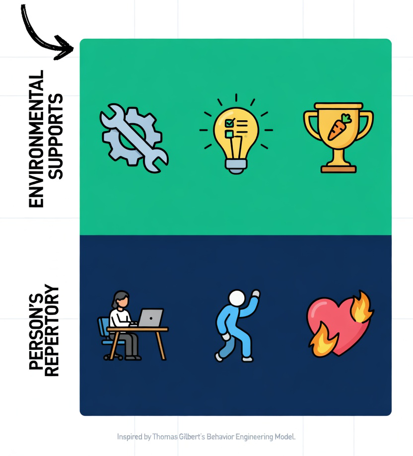
Read more: Why Your Service Design Keeps Failing (And How Gilbert’s Ghost Just Whispered the Fix)
What Chesterton's Fence Can Teach Us
- Details
- Written by: Gary Elsbernd
I work in a long-established organization (160 years old) with an intricate series of acquisitions, mergers, and history in our client-facing and back-end systems. We sometimes get new designers who want to blow away all existing designs and features, to start from a clean slate. While it can be very satisfying to march forward with no boundaries or restrictions, we have to honor the past and remember everything in place was put in place for a reason.
Chesterton’s Fence is a principle that reminds us to look before we leap. To understand before we act. It’s a cautionary reminder to understand why something is the way it is before meddling in change. The principle comes from a parable by G.K. Chesterton.
There exists in such a case a certain institution or law; let us say, for the sake of simplicity, a fence or gate erected across a road. The more modern type of reformer goes gaily up to it and says, “I don’t see the use of this; let us clear it away.” To which the more intelligent type of reformer will do well to answer: “If you don’t see the use of it, I certainly won’t let you clear it away. Go away and think. Then, when you can come back and tell me that you do see the use of it, I may allow you to destroy it.”
In its most concise version, Chesterton’s Fence states the following:
“Do not remove a fence until you know why it was put up in the first place.”
Crafting Seamless Experiences
- Details
- Written by: Gary Elsbernd

In today’s fast-paced digital landscape, users are bombarded with an overwhelming amount of information every second. To cut through the noise, simplicity in UX design is no longer just a trend; it’s a necessity. A user-friendly, minimalist approach not only enhances usability but also ensures your design resonates with users, reducing cognitive overload and promoting positive engagement.
Simplicity, however, is not just about aesthetics. It’s about creating experiences that feel effortless, intuitive, and enjoyable, even when the user is navigating complex systems. When done right, simplicity leads to faster, smoother interactions, leaving users with a sense of satisfaction and accomplishment.
Why Simplicity Matters in UX
-
Improved Usability: A clutter-free interface lets users find what they need without confusion. When elements are minimal yet purposeful, users intuitively know how to engage with them.
-
Reduced Cognitive Load: Users can process information more easily when their attention isn't diverted by unnecessary elements. A simple design guides their focus to what matters most.
-
Enhanced Focus: A clean layout removes distractions, letting users concentrate on the content and tasks at hand—whether it’s reading an article, making a purchase, or booking a flight.
-
Increased Engagement: The joy of using a design that’s both simple and intuitive fosters deeper user satisfaction. A positive experience is more likely to keep them coming back.
-
Faster Loading Times: Simple designs typically require fewer resources, leading to quicker load times. In a world where attention spans are short, faster websites mean happier users.
Page 1 of 6