There is a fine line between awful and so awful it’s great. These are the guilty pleasures that we all enjoy when watching something that is so horribly written, acted or directed that you can’t help but laugh. That’s what made Mystery Science Theater 3000 such a blast – you got to poke fun at the movie you were ostensibly watching along with Mike, Crow and Tom. Here are a couple of my more obscure “So Bad It’s Good” confessions. If I can get comments working, I’d love to hear your confessions as well.

Kaboom cereal is bad. Really bad. In college, I don’t remember if someone bought this on a dare, or got the munchies and thought it might be worthwhile, but there was a box purchased boasting of 45% of your daily recommended allowance of 7 vitamins and minerals (for those of you keeping score, this is just below pop-tarts on the nutritional scale). The moment the milk touched the multicolored psychotic clown shaped nuggets, they dissolved into a formless gray mash. Totally uneatable.Kaboom became a meme around our residence halls. That box, and more to follow it, became traveling trophies of a sort, as they were handed out as house-warming gifts, door prizes or other random gift occasions. Following the logic that we were all brought up not to waste food, and that gifts were to be displayed when the gifter is around, these boxes were passed from hand to hand, because no one would ever finish a box and feel right about throwing it away. My roommate, Troy, used to carry a spare box or two in the trunk of his Impala, just in case a gift giving opportunity arose.
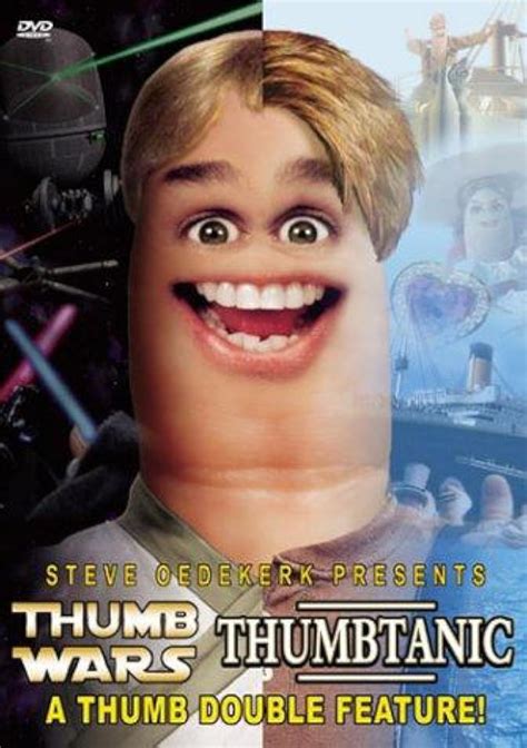
Steve Oedekirk is a genius. Not at writing, directing or acting, but in getting us to spend money on garbage like this. Thumb Wars and Thumbtanic, a Thumb Double Feature, is a parody of the real movies, acted out by thumbs with eyes and mouths greenscreened on. Really, really bad. The whole premise is so insipid that it reminds you of the stories we told each other of children, with no plot or direction, making it up as we go along and just doing whatever it takes to get a laugh at the moment. Again, this is a great gift idea, because no one will ever, EVER, buy this for themselves. His other films include “Thumb Wars: The Phantom Cuticle”, “BatThumb”, “FrankenThumb”, “The GodThumb” and “The Blair Thumb”.One thing I didn’t realize until talking with my friend, Kevin the FilmGuru, this past week, is that Steve Oedekirk also wrote the screenplays for Bruce Almighty, Evan Almighty, Barnyard, Ace Ventura: When Nature Calls and Patch Adams.
My wife doesn't know what I do at work. I tell her all the time, but her eyes glaze over sometime into the second paragraph like mine do when she discusses her work in the neonatal intensive care unit. I find my work endlessly fascinating, but I'm in the minority. What I do is develop user experience designs from which talented developers create world class web applications.
The job is part psychologist, part librarian and part artist. I have to understand organizational objectives and personal motivations, catalog knowledge and design components, and weave them together into a interface that so closely supports the intended task that it becomes invisible to the user.
I learned my craft over the past two decades after being exposed to a variety of methodologies and techniques. My current practice most closely resembles the Performance Centered Design methodology developed at Ariel Performance Centered Systems and documented by Barry Raybould.
Business Process Mapping - A clear understanding of the current and desired business process, including what the business needs out of the process and how the user is incented to perform the task, is needed to develop a system that satisfies everyone. These flow charts are then broken down into information needs for each step to ensure the user can make the right choices. I don't usually have to do the process maps myself, but I usually influence them and must understand them.
Scenario Development - A scenario describes a single instance of a use case in as much detail as necessary to tell a story. The scenario provides a narrative that can objectively be assessed to ensure the prototype solves the problem. A number of scenarios are developed to cover variety of tasks, user groups and work contexts. Sometimes I share these with my team, but often it's just a structure for me to demonstrate the prototoype.
Prototyping - The processes are divided into screens to support the task and an interface flow is developed to show how the screens interact. HTML prototypes of the screens are developed and linked to support the story developed in the scenario. The evaluators can see how the task progresses from screen to screen with as much fidelity in the data and functionality as necessary to understand the intended design.
Evaluation - Users review and identify holes in functionality, information or the process.
Refinement and documentation - After iterating through the prototype, the design will solidify and coalesce into an accepted design. That design is documented with an annotated powerpoint of the prototype and user interface specification describing every control, behavior and data element present in the prototype.
Maintenance - inevitably, the scenarios don't cover anything, and sometimes technical limitations require compromises in the design. As a designer, I stay involved through testing and deployment to ensure the system works in the real world.
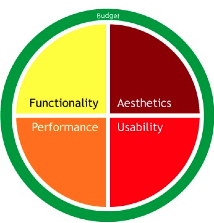
Elsbernd's Hierarchy of Needs, described in my blog a few months ago, has been hanging on my wall at work. I've given it some thought and while there are aspects of it that I really like, such as the concept of satisfiers and delighters (functionality and performance are satisfiers, usability and aesthetics are delighters), I was forced to admit the model doesn't hold true for all applications.
The original idea came from the traditional commercial enterprise software development model, in which at first, relevant functionality was enough for a new application to be successful. As long as the software accomplished something users were previously unable to do, it didn't matter if the system was slow, difficult to learn or use, or hideously ugly, it accomplished a task. Eventually, users become complacent and start demanding more functionality, faster or more dependable performance, easier to use and more pleasing to the eyes.
Eventually, functionality and performance is taken as a given, and only their absence is noted. Usability and Aesthetics, on the other hand, are delighters, in that their presence can increase satisfaction with a system. This is a gross generalization, of course, and doesn't adequately defend against some very legitimate criticisms.
Systems aren't built in a hierarchy - all systems have some level of all four attributes. They serve some purpose, have some level of performance, can be used at some level, and have a presentation. It's not accurate to say systems are built one layer of the hierarchy at a time or to imply that the concerns are always approached in the same order.
The dividing line between satisfiers and delighters is not black and white. Some features and functionality are delighters. When a system does something for you that you didn't expect or even know you wanted can be a delighter, and many of the aesthetic choices made are definitely dissatisfiers.
Not all systems will become "self actualized" at the top of the hierarchy. There are reasons systems may never be developed into an attractive, easy to use system. Sometimes the benefits don't justify the cost. If a system is going to be retired, no new development will be funded. The model does not address the downward pressure of cost or limited resources against the desire to climb the hierarchy.
After weighing these criticisms, my thoughts lately have changed. I no longer see the factors in a hierarchy, but as competing priorities for a limited pool of resources.
All systems development teams must prioritize their time and resources among the four factors. To increase the resources for usability, attention is taken away from the others, unless additional budget is found. There is no ideal allocation of resources to each of the factors. Just as no two applications have the same requirements, the needs of the organization or users may be different from one project to the next. Depending on the functionality needed, performance environment, age and training of the users and the visibility of the application in the marketplace, any one of these factors may be weighted more heavily during development.
The allocation of resources may change over time as a system matures. Once the application is established or as competition enters the market, balancing the factors may become a higher priority. The main point is the factors must fight for space within a given budget of resources and energy.
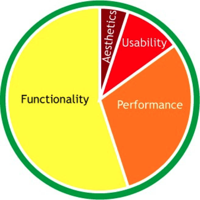
Traditional systems may follow the hierarchy early in their evolution and favor functionality over any other factors. Systems like mainframes and legacy systems may have interfaces considered unusable by modern standards. They may be difficult to learn and use, involve obscure and arcane codes, or even paper punchcards. Younger users may not believe it, but there was a time before graphic user interfaces. Many of these systems still exist in organizations because they work. They do something relevant for the company and they haven't caused enough pain to be retired or upgraded. Because these systems do what they do well, they no longer receive funding, and the resources they do get are focused on maintaining the system, not upgrading functionality or improving the user experience.
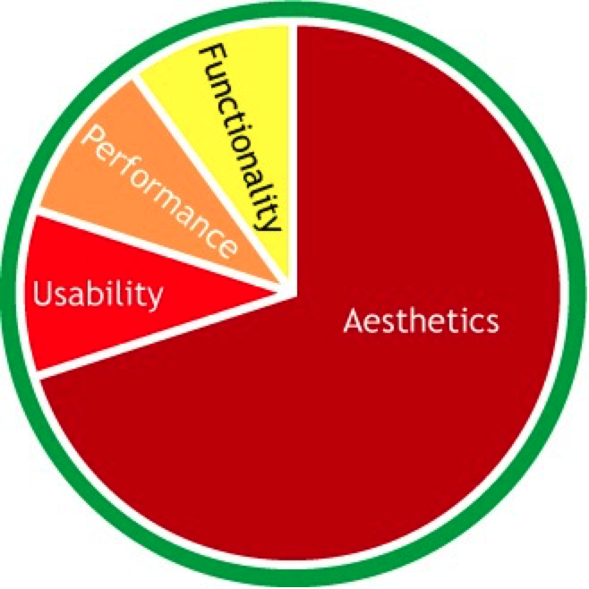
On the other end of the spectrum are the trendy novelty applications that take advantage of trends or new developments and are seen as the "gee whiz" stuff for a limited amount of time. Consider new developments such as animated gifs, scrolling marquees or flash intro pages. These toys don't add much functionality to a website, and are mostly eye candy. For the most recent examples, turn to the iPhone applications. Developers saw a rich media device with the novelty hooks of a touch-screen and accelerometer and rushed out the technological equivalent of cotton candy such as the virtual lighter (moves as you move the phone), koi pond, virtual beer and light saber. These applications have next to no functionality other than momentary amusement. The performance of the application is not a focus as it doesn't do that much to start with. Likewise, if it doesn't do much, it won't be hard to use. These applications have a limited shelf life as the novelty dies, but for the brief period of time, they can be successful.
I have to thank several people for challenging my thinking and discussing the concepts with me, including Matt Sanning and Greg Moore. These thought exercises, like the iPhone apps, may not be the most productive things, but they keep me entertained.
One of the podcasts I listen to - Boagworld by Paul Boag - had an interesting feature this week about context - about how where we are influences what we want from a website. Paul listed five contextual considerations for developing for the web; Environment, Device, Comfort, Mood, Time. He makes good points about them, especially the lack of traditional input tools on most mobile devices, but doesn't go far enough into motivations. This tied into many things I've been thinking about with the release of the 3G iPhone.
Like most people, 99% of my browsing is done from a laptop or desktop sitting on a desk. For these times, traditional websites are fine, and even optimized for the experience. I have an expectation that I can browse, dig deeper and see layouts on a computer with high-bandwidth, full browsers and plugins and a high-resolution, large screen as they were intended by the designer. From design to implementation to interaction, everything about the web browsing experience has been optimized for my viewing pleasure in a relaxed setting.
My mobile surfing experience has been on a Palm Treo. The screen is much smaller, the input is more awkward (no mouse) and the speeds are much, much slower. When I surf on my phone, I generally need specific information such as an address, geocache description or a sports score. The experience is much different in many ways, and not just that the hardware is less capable and I may be outside. I also want to use the mobile for different things.
When you are at a desk, you have the opportunity to browse. The idea of "surfing the web" came from the idea of skimming the top of the ocean of information, going where the wave takes you and finding things through serendipity. When you are mobile, you are much more targeted on a specific need. I don't want to look at a company's brochures or product demos on a phone. I don't need all of your pretty branding and themes if I am browsing over a 3G or Edge network. There is a greater sense of urgency and focus.
The solution used to be a WAP (wireless access protocoal) site that is optimized for the mobile browsing platform - it has scaled back images, floats into a narrow column that can be read on a 320x240 screen, and has large links and buttons for tapping. A good example is ESPN for getting game scores and play-by-play: http://wap.espn.com/ You can within three clicks find any college football game on a Fall Saturday and watch see short play-by-play descriptions on an automatically refreshed page. On a regular computer, the interface is hideous compared to what we've been led to expect, but on a phone, the load times are lightning quick, and interactions and decision points are crisp, getting you where you want to go quickly and with a minimum of fuss. Compare this with their regular doorway of http://www.espn.com/. The mobile site features next to none of the graphics, advertisements and animations of the website. It allows you to dig deeper into the stories you want to see, but leaves out many of the feature stories and options that wouldn't translate to the mobile web. ESPN knows what their mobile users want and how that differs from what they want when they sit down at a computer, and delivers.
The iPhone and the new 3G iPhone started to change the thinking around mobile browsing. Having the Safari browser installed and their zoom features lead developers to think there is no longer a need for a WAP. Users can browse their entire traditional site on their phone, so we don't have to change a thing. The missing factor in this equation is still intent.
In my work in the insurance industry, I have often wanted to develop a WAP application, to see how it's done and experiment. The problem is, no one wants to work on their insurance while they're mobile. Reviewing insurance is a more reflective task, requiring paperwork, comparisons and details that cannot be easily supported in 320x240. I will find a way to do this, as our sales force is mobile, but other than basic communications covered by email, twitter, SMS and actual phone calls (do phones still make phone calls?), I haven't found the killer application yet that is targeted, a short duration, requires minimal entry and can be done without a lot of reference materials at hand.
Give me time.
Gloria Gery, author of Electronic Performance Support Systems and Making CBT Happen, and my mentor in the 1990s, once told me that all systems training is compensatory for poor design. In other words, if the design is perfect, no training is needed.
"Just remember: you're not a 'dummy,' no matter what those computer books claim. The real dummies are the people who–though technically expert–couldn't design hardware and software that's usable by normal consumers if their lives depended upon it." - (Walter Mossberg)
This thought has stuck with me as I've designed every increasingly complex systems. I've decided I agree with her, and that it's not a bad thing.
Before you start sending emails, this doesn't say:
-
All training is unnecessary in every case. Training is necessary to incorporate new employees into a business. Domain knowledge about the business you are in, corporate attitudes, principles and guidelines must be learned, along with key procedures in case of emergencies. What this does imply is training should be focused on value-added information that is best transferred person-to-person, instead of rote procedures and facts about systems.
-
People should be able to walk up and use a system to its fullest. The system should be built so that given a user knowing WHAT he or she is supposed to do, HOW to do it is evident. Shortcuts and other productivity enhancements may be learned over time, but their absence should not inhibit or prevent performance of the task.
-
Designing systems that require no training is possible, or even desirable in all situations. Such explicit systems require a great deal of knowledge of the performance environments, users, motivations, business needs and capabilities. The time spent to develop a training free system may not be justified by the benefits. If a short tutorial or instructions and system help within the application can help the user grasp the essentials, it may be a better use of resources to go this way.Additionally, ease of learning does not always equate with ease of use. A system that is easy for anyone off the street to use is rarely one that "expert" users can use productively. Consider most "wizard" interfaces. An interview style interface walks the user through decision points and gathers information. The wizard presents the decisions along with explanations of the implications of the step. These systems can be used by nearly anyone because the domain knowledge and how it is represented in the system are explicit. If an expert user does not require such handholding, a single screen interface with just the data fields may be sufficient to perform the task much more efficiently. Familiarity with the business and a system allows experts to rapidly perform tasks such as data entry at a speed that would be impossible in a wizard-like interface.
As a designer, I strive to design the most intuitive systems and applications I can. I go into a design knowing some training will probably be necessary, but I don't give in to the temptation to say, when faced with a design compromise, "Oh, that will be covered in systems training."
My approach has been to design a system as intuitively as possible, and then, based on user feedback during testing, add instructions to the screens and information to reference and training. The key is frequent and iterative testing. Get a design out in front of as many people as possible. When faced with an issue, either integrate a solution into the application, add on-screen instructions, add online reference or training, or add it to a training class curriculum. This "Frequently Asked Questions" method of systems documentation and training allows the trainers to focus on issues that realistically come up instead of spending time and effort documenting functions and behaviors that are well accepted by everyone.
Now you may let the emails fly. :)